
本篇内容主要讲解“R语言可视化中柱形图的美化技巧”,感兴趣的朋友不妨来看看。本文介绍的方法操作简单快捷,实用性强。下面就让小编来带大家学习“R语言可视化中柱形图的美化技巧”吧!
昨天以最简单的单序列柱形图作为对象详细的讲解了关于套用主题以及图表美化的思路。
今天就我们常用的几种柱形图的衍生图表——簇状柱形图、堆积柱形图、百分比堆积柱形图的美化工作进行讲解。
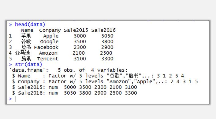
我们还是以昨天的数据作为演示数据,同时添加两年度数据。
data<-data.frame(Name=c("苹果","谷歌","脸书","亚马逊","腾讯"),Conpany=c("Apple","Google","Facebook","Amozon","Tencent"),Sale2015=c(5000,3500,2300,2100,3100),Sale2016=c(5050,3800,2900,2500,3300))
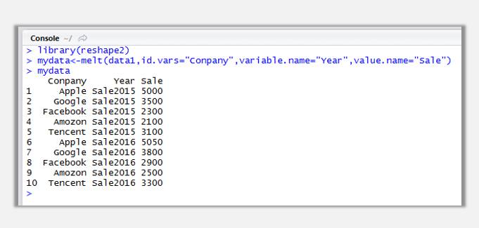
由于今天的案例数据中有两个年份的数据,其实算是汇总过的二维表(宽数据),不符合R语言图表数据源的结构(一维表、长数据),所以需要使用reshape2包中的melt函数对数据进行重塑,将其变为长数据进行作图:
library(reshape2)
mydata <- melt(data1,id.vars="Conpany",variable.name="Year",value.name="Sale")
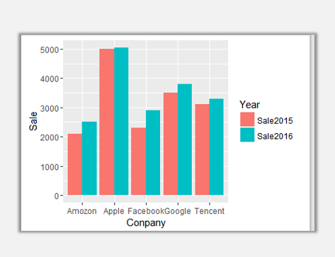
接下来就要使用语法作图喽,一定要瞪大眼睛哦~
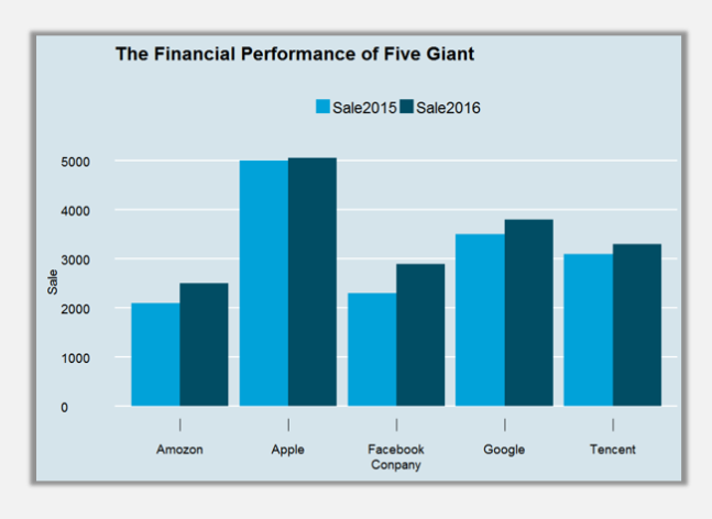
ggplot(mydata,aes(Conpany,Sale,fill=Year))+geom_bar(stat="identity",position="dodge")
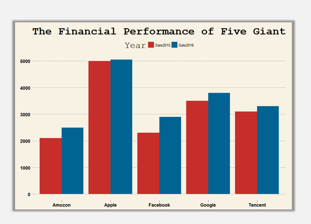
套用主题:
ggplot(mydata,aes(Conpany,Sale,fill=Year))+geom_bar(stat="identity",position="dodge")+ggtitle("The Financial Performance of Five Giant")+theme_wsj()+scale_fill_wsj()
ggplot(mydata,aes(Conpany,Sale,fill=Year))+geom_bar(stat="identity",position="dodge")+ggtitle("The Financial Performance of Five Giant")+theme_wsj()+scale_fill_wsj("rgby", "")
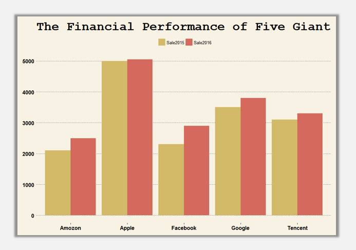
ggplot(mydata,aes(Conpany,Sale,fill=Year))+geom_bar(stat="identity",position="dodge")+ggtitle("The Financial Performance of Five Giant")+theme_wsj()+scale_fill_wsj("rgby", "")+theme(axis.ticks.length=unit(0.5,'cm'))+guides(fill=guide_legend(title=NULL))
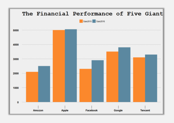
ggplot(mydata,aes(Conpany,Sale,fill=Year))+geom_bar(stat="identity",position="dodge")+ggtitle("The Financial Performance of Five Giant")+theme_economist(base_size=14)+scale_fill_economist()+theme(axis.ticks.length=unit(0.5,'cm'))+guides(fill=guide_legend(title=NULL))
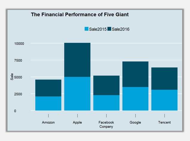
堆积柱形图套用主题:
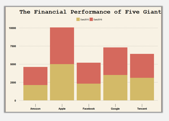
ggplot(mydata,aes(Conpany,Sale,fill=Year))+geom_bar(stat="identity",position="stack")+ggtitle("The Financial Performance of Five Giant")+theme_wsj()+scale_fill_wsj("rgby", "")+theme(axis.ticks.length=unit(0.5,'cm'))+guides(fill=guide_legend(title=NULL))
ggplot(mydata,aes(Conpany,Sale,fill=Year))+geom_bar(stat="identity",position="stack")+ggtitle("The Financial Performance of Five Giant")+theme_economist(base_size=14)+scale_fill_economist()+theme(axis.ticks.length=unit(0.5,'cm'))+guides(fill=guide_legend(title=NULL))
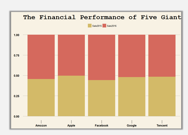
百分比堆积柱形图套用主题:
ggplot(mydata,aes(Conpany,Sale,fill=Year))+geom_bar(stat="identity",position="fill")+ggtitle("The Financial Performance of Five Giant")+theme_wsj()+scale_fill_wsj("rgby", "")+theme(axis.ticks.length=unit(0.5,'cm'))+guides(fill=guide_legend(title=NULL))
ggplot(mydata,aes(Conpany,Sale,fill=Year))+geom_bar(stat="identity",position="fill")+ggtitle("The Financial Performance of Five Giant")+theme_economist(base_size=14)+scale_fill_economist()+theme(axis.ticks.length=unit(0.5,'cm'))+guides(fill=guide_legend(title=NULL))